The best way to improve your business, increase revenue and boost profits is through the use of infographics. Infographics are a simple and easy-to-understand way for you to communicate complex concepts, data or messages quickly and effectively with your audience. However, there are common mistakes that all too many people make when creating their own infographic. In this article we will take a look at the eight most common mistakes made by those looking to create an infographic and how you can avoid them.
- Too Busy.
People are not going to take the time to look at your infographic if it is too busy, confusing or unclear. Everything in your infographic should have a purpose and nothing more. Cut out all unnecessary elements that will cloud up the message you are trying to convey. By reducing superfluous information you will make your infographic much easier to understand which will make it more effective.
- Poorly Designed.
The design of your infographic is absolutely paramount. If the design looks like it was done by a third grader using MS Paint, no one is going to be impressed, regardless of how great your message may be. The first impression you give with your infographic is the design and if it looks amateurish, people will simply move on without even looking at your message.
- Not Reflective of Your Target Audience.
Your infographic should reflect your target audience. If you are targeting physicians, for example, an infographic that is too edgy or hip isn’t going to connect with your audience. Targeting an older demographic? Then make sure your infographic is easy to read and doesn’t contain any complicated terminology (unless of course you are targeting other physicians).
- Too Wordy.
Infographics should be concise, clear and direct. If you feel that you need to use ten words when five will do the job, then you are likely guilty of making your infographic too wordy. Too many words will result in people simply not reading your infographic. The goal is for people to understand the message within seconds, not minutes or hours.
- Poorly Written and Unedited.
The content for infographics should always be well thought out and written in a conversational tone. If you are unsure of how to do this yourself simply look at infographics that others have created and note the writing style. Your text should also be thoroughly edited. No typos, no grammatical errors, just simple clear writing.
- Not Optimized for Mobile Devices.
More people are surfing the web from mobile devices these days, especially from their smartphones. They don’t only access entertainment platforms, like Bet22 or Netflix, but also work using their devices, as it gets more handy. If your infographic is not optimized for mobile then you could be losing a significant amount of web traffic because people simply can’t access it. The message in your infographic should also be very clear and concise so that it is easily understood on a mobile device.
- Poor Quality Images.
Not only should you avoid using images that are copyrighted or trademarked, make sure the rest of your images don’t look like they were taken by an 8th grader with a cell phone. Invest in quality stock photos and make sure your whole infographic is aesthetically pleasing.
- No Call to Action (CTA).
Your infographic should offer a clear and direct call to action at the end. You should not simply end your infographic with a tease that you will be releasing more information soon or offering other links for people to explore. If there is no CTA then there is no point in creating an infographic in the first place.
You can avoid all these mistakes by simply following these simple tips:
- Keep it Simple.
There is a fine line between making your infographic too busy and making it overly simplistic — aim for somewhere in the middle. If you can’t eliminate certain elements then make them smaller or lighter to ensure they don’t take away from the rest of the design. If you are unsure if your infographic is too busy, show it to other people and get their honest feedback.
- Check for Legibility and Understandability.
Before you send out your infographic make sure that all text is easy to read and understand. Ask yourself how 20 different people would interpret each section of your design — what will they take away from it? If you are unsure if your infographic is clear enough, show it to other people and get their honest feedback.
- Get Feedback from the Right People.
Don’t show your infographic to someone who will simply say “yes” or give you any generic feedback. You want honest answers that will help improve your design so find people who are familiar with your target audience.
- Use an Eye-Catching Layout.
Your infographic should be easy to read and aesthetically pleasing at the same time — this can sometimes be difficult to do but is well worth it. If you are unsure of how to create a good layout, find the best infographics that other people have created and note their pattern.
- Optimized for Mobile Devices.
More people are surfing the web from mobile devices these days, especially from their smartphones — make sure your infographic is optimized for mobile or risk losing a significant amount of web traffic. The message in your infographic should also be very clear and concise so that it is easily understood on a mobile device.
- Quality Images.
Not only should you avoid using images that are copyrighted or trademarked, make sure the rest of your images don’t look like they were taken by an 8th grader with a cell phone — invest in quality stock photos and make sure your whole infographic is aesthetically pleasing.
- Include a Call to Action (CTA).
Your infographic should offer a clear and direct call to action at the end – do not simply end your infographic with a tease that you will be releasing more information soon or offering other links for people to explore. If there is no CTA then there is no point in creating an infographic in the first place.
- Use Venngage.
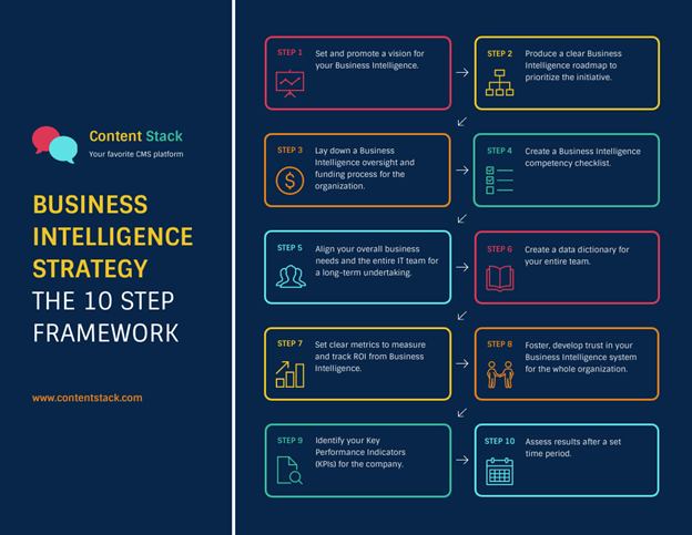
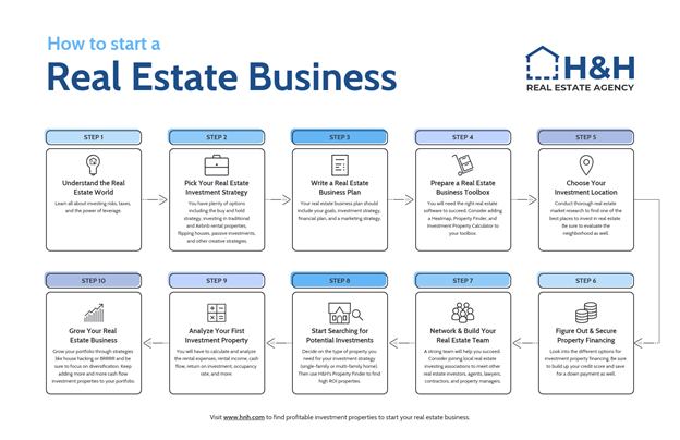
Venngage is an online infographic maker that provides a wide range of various infographic templates people can use for many different purposes. To give you an idea, here are some cool infographic examples from their website.


Infographics are a great way to make your business seem more credible and trustworthy. They also help generate leads for your company by providing valuable information that is easy to digest, which people will likely share with their friends or co-workers. Use the tips we have provided in this article as a guide so you can create infographics that drive sales and stand out from those created by competitors. If all of this seems too daunting for you, consider using Venngage infographics — you’ll be able to create your own visuals in just minutes!

Skilz Learn
Thank you for sharing your insights. I completely concur with your points and value your clarity on the subject.